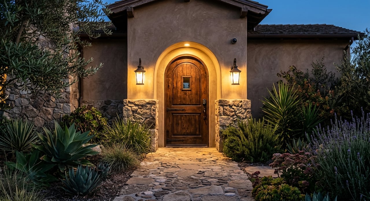
Choosing the right paint tones for your home interiors can transform a space, creating an atmosphere that reflects your personal style and enhances the overall aesthetic. Color theory plays a crucial role in this process, guiding homeowners in selecting hues that complement each other and evoke the desired mood. Understanding the principles of color theory can help you make informed decisions, ensuring your home is both beautiful and harmonious.
Understanding the Color Wheel
The color wheel is a fundamental tool in color theory, illustrating the relationships between primary, secondary, and tertiary colors. Primary colors—red, blue, and yellow—are the building blocks of all other colors. Secondary colors, such as green, orange, and purple, are created by mixing primary colors. Tertiary colors result from blending primary and secondary colors. Familiarity with the color wheel can help you identify complementary colors, which are opposite each other on the wheel and create a vibrant contrast when paired together. This understanding is essential for creating balanced and visually appealing color schemes in your home.
Exploring Warm and Cool Colors
Colors are often categorized as warm or cool, each evoking different feelings and atmospheres. Warm colors, such as reds, oranges, and yellows, can make a space feel cozy and inviting. They are ideal for social areas like living rooms and dining rooms, where you want to encourage interaction and warmth. Cool colors, including blues, greens, and purples, tend to create a calming and serene environment, making them perfect for bedrooms and bathrooms where relaxation is key. Recognizing the impact of warm and cool colors can guide you in selecting tones that align with the function and mood of each room.
The Role of Neutrals
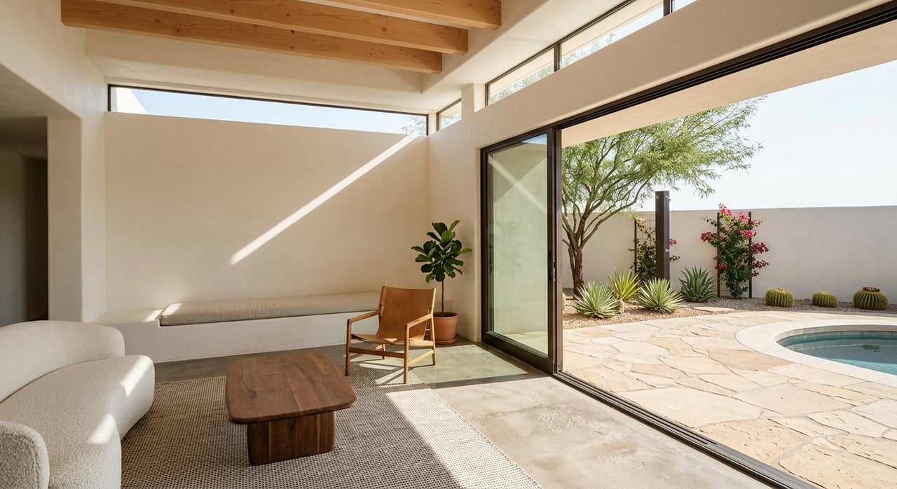
Neutrals, such as whites, grays, and beiges, play a vital role in color theory for home interiors. They provide a versatile backdrop that can balance bold colors or create a minimalist aesthetic. Neutrals are also excellent for highlighting architectural features or artwork, allowing other elements in the room to stand out. When choosing neutral tones, consider the undertones—whether they are warm or cool—as this can affect how they interact with other colors in the space. Neutrals offer flexibility and timelessness, making them a popular choice for many homeowners.
Creating Monochromatic Schemes
A monochromatic color scheme involves using variations of a single hue, creating a cohesive and sophisticated look. This approach can add depth and interest to a room without overwhelming it with multiple colors. To achieve a successful monochromatic scheme, incorporate different shades, tints, and tones of the chosen color. For example, a room painted in various shades of blue can range from light sky blue to deep navy, providing contrast and visual interest. Monochromatic schemes are ideal for creating a serene and elegant atmosphere, particularly in spaces where simplicity is desired.
Using Analogous Colors
Analogous color schemes consist of colors that are next to each other on the color wheel, such as blue, blue-green, and green. These schemes are naturally harmonious and pleasing to the eye, making them a popular choice for home interiors. Analogous colors work well in creating a sense of unity and flow within a space, as they share similar undertones. When using an analogous scheme, it's important to choose one dominant color and use the others as accents to avoid overwhelming the space. This approach can create a cohesive and inviting environment, perfect for open-plan living areas.
Incorporating Complementary Colors
Complementary colors are opposite each other on the color wheel, such as red and green or blue and orange. When used together, they create a dynamic and energetic contrast, adding vibrancy to a room. Complementary color schemes are ideal for spaces where you want to make a bold statement or highlight specific features. To avoid a jarring effect, it's essential to balance the intensity of complementary colors by using one as the dominant hue and the other as an accent. This balance ensures that the room remains visually appealing and harmonious.
The Impact of Lighting on Color
Lighting plays a crucial role in how colors appear in a space, influencing their intensity and tone. Natural light can vary throughout the day, affecting how paint colors look at different times. Artificial lighting, such as warm or cool bulbs, can also alter the perception of color. When selecting paint tones, it's important to consider the lighting conditions in each room and test samples under different lighting scenarios. This consideration ensures that the chosen colors maintain their desired appearance and complement the room's overall ambiance.
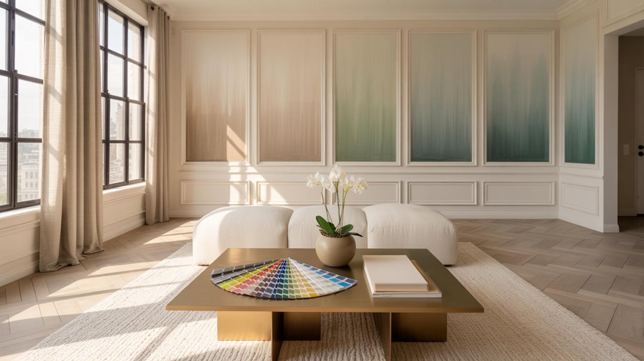
Testing Paint Samples
Before committing to a paint color, testing samples is a vital step in the selection process. Paint small sections of the wall with different shades to see how they interact with the room's lighting and other elements. Observing the samples at various times of the day can help you determine which color best suits the space. Testing samples also allows you to experiment with different finishes, such as matte or satin, which can affect the final look of the paint. This hands-on approach ensures that you make an informed decision and achieve the desired outcome.
Balancing Color with Texture
Incorporating texture is an effective way to enhance a color scheme and add depth to a room. Textured elements, such as fabrics, rugs, and wall coverings, can complement or contrast with the chosen paint tones, creating a layered and visually interesting space. For example, pairing a smooth, glossy paint finish with a textured fabric can create a striking contrast that adds dimension to the room. Balancing color with texture allows you to create a dynamic and engaging environment that reflects your personal style.
Considering the Overall Home Aesthetic
When choosing paint tones, it's important to consider the overall aesthetic of your home and how each room fits into the larger design scheme. Consistency in color choices can create a sense of cohesion and flow throughout the house, while strategic variations can highlight individual spaces. Consider the architectural style of your home and any existing elements, such as flooring or cabinetry, that may influence your color choices. By taking a holistic approach, you can ensure that your paint selections enhance the beauty and functionality of your home.
Transform Your Home with the Right Colors
Choosing the perfect paint tones can truly transform your home, making it a more inviting and harmonious space. By understanding color theory, you can create an atmosphere that reflects your personality and enhances your living experience. Whether you're looking to refresh a single room or your entire home, the right colors can make all the difference. For personalized advice and expert guidance, reach out to Carey More today and start your journey to a beautifully colored home.